Pages

Saturday, March 31, 2012

Creative Chemistry 101, Day 10


Today I worked with distress stickles.  I have had a set of distress stickles for a long time but I didn't know how to use them.  Well, Tim Holtz did a great video on how to use them and now I know how! :)

I Used:
- Shabby French stamp set, Stampers Anonymous
- Worn Lipstick Distress Stickles, Ranger
- Broken China Distress Stain, Ranger
- Victorian Velvet Distress Ink Pad, Ranger
- Iced Spruce Distress Ink Pad, Ranger
- Evergreen Bough Distress Ink Pad, Ranger
- Antique Linen Distress Ink Pad, Ranger
- Shell, Slice Machine, Making Memories
- Under the Sea, Slice Design Card


This stuff really sparkles!

Another view


A woman's heart is a deep ocean of secrets. ~ Gloria Stuart


Thursday, March 29, 2012

Creative Chemistry 101 - Day 9

Ok, so not exactly going in order. [blush]  But I've been feeling a little under the weather.  I decided to try out Day 9 since Tim Holtz was featuring Perfect Pearls.  I like sparkle!  I experimented a little by stamping on a dark image using the Distress Ink Pads and Perfect Pearls.  My little experiment worked and the Perfect Pearls let the writing show through in the light. :)

I USED:
- Shabby French Stamp Set, Stampers Anonymous
- Jet Black, Archival Ink by Ranger
- Iced Spruce Distress Ink Pad, Tim Holtz, Ranger
- Festive Berries Distress Ink Pad, Tim Holtz, Ranger
- Brushed Coduroy Distress Ink Pad, Tim Holtz, Ranger
- Blue Smoke Perfect Pearls, Ranger
- Broken China Distress Stain, Tim Holtz, Ranger

I stamped the tag in Jet Black Archival Ink.

Next, I stamped using Distress Ink Pads and
brushed on Blue Smoke Perfect Pearls.

The Perfect Pearls highlights the writing
on the black image!

Here is another tag I made using the Perfect Pearls Misting Technique:


An added bonus is the texture!

Another view.


It shimmers everwhere!


There is one thing one has to have: either a soul that is cheerful by nature, or a soul made cheerful by work, love, art, and knowledge.
~Friedrich Nietzsche


Monday, March 26, 2012

Journey of a Lifetime


This is a layout I made for a trip we made to Colorado this past summer.  It was just as gorgeous as my husband had promised.  He had lived there for several years before he came out East.  The title has a double meaning for me.  The first is obvious because it just refers to the trip.  The other is that our journey together as a couple and as a family is truly a journey of a lifetime.  I couldn't be a luckier woman. :)

I Used:
- Heritage Cricut Cartridge, Provocraft - "Journey" and "Lifetime" words
- Kate's ABC's Cricut Cartridge, Provocraft - o, f, a letters
- My World Cricut Cartridge, Provocraft - Compass and Airplane
- Vintage Papers Imagine Cartridge, Provocraft - second image, p. 9, background paper on the sticky-back canvas
- Tan paper from my stash
- Tattered Time Paper stack, Die Cuts with a View (DCWV) - mat
- Antique Linen Distress Pad, Tim Holtz Ranger
- Brushed Corduroy Distress Pad, Tim Holtz Ranger
- Victorian Velvet Distress Pad, Tim Holtz Ranger

I added a yellow Imaginisce rhinestone on the compass
I frayed the edges of the canvas to give it a more vintage look.
I also blended the distress ink on the edges.


I love the little flourishes on the "J" and the "L"


Sunday, March 25, 2012

Creative Chemistry 101, Day 4


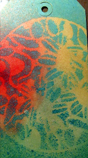
Today I tried out two techniques.  This tag was made using Distress Re-Inkers as watercolors.  I don't know how successful I was.  But it was fun to experiment.


The second technique is the Layered Spraying Re-Inkers Technique.  I don't have too many Re-Inkers so I blended some of the colors on the first layer. 


I used the same stencil. but slightly different colors.  

Saturday, March 24, 2012

Creative Chemistry 101, Day 3


It is actually several days past day 3 of the class, but I did not have Archival Ink.  Now I do! :)  This is my tag for the Alcohol Ink Agate Technique.

I did not like it at first.  It looked like a big ole mess to me.  But then I added more layers and the stamp images - Wow!  I think it took on a different look.  It's kind of fun not knowing that what somethin is going to look like exactly.

I Used: 
Glossy Paper
- Salmon Alcohol Ink, Ranger
- Cloudy Blue Alcohol Ink, Ranger
- Latte Alcohol Ink, Ranger
- Lettuce Alcohol Ink, Ranger
- Silver Mixative Alcohol Ink, Ranger
- Shabby French Stamp Set, Stampers Anonymous - sentiment, flourish, and writing on the heart
- Archival Ink in Jet Black, Ranger
- Vellum Heart, SEI

Tag
- Antique Linen Distress Ink Pad
- Brushed Distress Ink Pad
- Floral Texture Fade Embossing Folder, Floral & Fancy Frames Set by Sizzix


I used a pop dot on the vellum heart after the Archival Ink dried.


I debossed only a small section of the tag.


Here's another friendship quote:

A single rose can be my garden... a single friend, my world.
~ Leo Buscaglia


Friday, March 23, 2012

Elegant Thank You


I made this card with Renee's Color Challenge in mind at I Came, I Saw, I Created.  I liked it so much I used the design for a card swap in the Cricut Circle.  I used dark brown gosgrain ribbon I got from the Dollar Tree.  I had no idea they had ribbon.  Good quality stuff, too! 

I used the frame from Simply Jane by Papertrey Ink.  The pink cardstock and sentiment is also from Papertrey Ink  - Mega Mixed Messages.  Can I tell you?  That stamp set has just about any sentiment you need. The yellow cardstock is from Bazille.  The tan pattern paper is from Melissa Frances.  The off white cardstock is from my stash.

I used Pop Dots to raise the frame and edged it with Antique Linen Distress Ink.


Here is a pic of the other card I made fore the swap:


Hem your blessings with thankfulness so they don't unravel.~ Author Unknown


Tuesday, March 20, 2012

Creative Chemistry, Day 2


I am learning a lot in Tim Holtz's Creative Chemistry 101 online class.  I learned about blending colors. BUT one of the most beautiful techniques is the brushless watercolor technique.  So simple but beautiful!  I used a regular tag instead of water color paper so I will try the watercolor paper later and see if they come out differently.

I Used:
Ranger, Tim Holtz Distress Ink Victorian Velvet
Ranger, Tim Holtz Distress Ink Iced Spruce
Ranger, Tim Holtz Distress Ink Evergreen Bough
Ranger, Tim Holtz Distress Ink Antique Linen
Stampers Anonymous, Tim Holtz Collection Shabby French

I LOVE this technique because of its soft look.  I will be using it more often.  I liked blending so much I blended colors on my seam binding. :D

Confession Time:  He didn't mention using Perfect Pearls but I couldn't resist adding a little shimmer to the butterflies.  Shhhhh...


If nothing ever changed, there'd be no butterflies. 
 ~Author Unknown


Sunday, March 18, 2012

For You, Your Majesty


I made this card for my dad who is ruler of all he surveys... ;)  This was a fun card to make and I used a crown and the color from challenges in the Cricut Circle Message Board. 

I Used:
- Baby Boutique Imagine Art Cartridge, 3rd icon on p. 33
- Crafty Secrets - Greetings from Wonderland stamp set
- Close to My Heart - "For You" sentiment - Card Word Puzzle stamp set - WOW! There are a lot of words you can mix and match in this set
- Cuttlebug - Musical Flourish folder
- Papertrey Ink - Kraft paper & white cardstock
- Seam binding from my own stash
- Tsukineko - Timber Brown Staz-On ink pad
- Ranger - Tim Holtz  - Distress Ink Pad - Victorian Velvet
- Ranger - Perfect Pearls
- Bazille - Red cardstock
- PrismaColor Pencils and Reeves Color Pencils
- Gamsol for Blending

Here's How:
I stamped the image on white cardstock in Timber Brown, a nice dark, espresso.  I colored the image using the color pencils and used the Gamsol to blend.  I used Victorian Velvet with the blending tool to ink the edges softly.


I cut the crown at 2.5 inches and added Perfect Pearls to make it sparkle.  Afterall, it is a crown. ;)


I dry embossed the kraft paper with Musical Flourish. 

I attached the seam binding on the side of the kraft paper and realized that I did not want white.  I had already added glue I decided to use Victorian Velvet with the blending tool.  A happy accident happened.  The ribbon picked up the embossing on the kraft paper.  How cool!!  I am going to do it on purpose from now on. I stamped "FOR YOU" on the seam binding.


"OFF WITH HER HEAD!"
Queen of Hearts, Alice in Wonderland
~Lewis Carroll

Jinger Adams Design Team Call


I made this Easter layout for the Jinger Adams Design Team Call.  Jinger Adams is the former spokesperson for Provocraft and is now striking on her own.  If her taste in shoes are an indicator, I just know what she has in store is going to be great ;) 

I wanted to make something fresh and that said, "Spring is here!"  I can't wait to take a picture on Easter that I can add to layout.  I will update this post with the picture I select. 

I Used:
- Claudine Hellmuth Sticky-Back Canvas in White
- Word Collage Porject Cricut Cartridge - Easter image printed using autofill
- Elise Imagine Color & Patterns Cartridge - pattern 1, p. 3  for Word Collage Easter image 
  light blue color from palette for EASTER letters from Kate's ABCs
- Hannah Montana - butterfly image - bttrfly cut at 4 in
- Kate's ABCs Cricut Cartridge - All letters cut at .7 in using the Baby Girl Font 2 Shadow feature and shift
  Bird-s for the E
  Apple-s for the A
  Shoes2-s for the S
  Teacup-s for the T
  Bunny-s for the R
- Prima Flowers November Chrysanthemums
- Imaginisce orange & yellow rhinestones
- All paper from Bazille
- We R Memory Keepers Corner Chompers 3/8
- White Seam Binding
- Imagine Cricut Machine

Here's How:
First, I flooded the Easter image from the Word Collage cartridge with the pattern from Elise.   Then I used the autofill feature to make the Easter image as big as possible.  The colors and image looked so beautiful I was tempted to just leave it as it was.


Then, I flooded the E, A, S, T, E, R with the light blue color from the Elise color palette.  I glued it on top of one of the colorful Easter words to make it stand out and added the Prima flowers which needed some bling to jazz them up :)  The Imaginisce rhinestones did the job.

I cut the butterfly from the Hannah Montana cartridge.  I had wanted one that looked delicate with a lot of flourish and this fit right in.  Some orange rhinestones gave it a little sparkle.


I rounded the edges of photo mats to soften the look and added the seam binding.


I added a Prima flower on the photo mat at the last minute.  It makes it more spring-like. 

Easter spells out beauty, the rare beauty of new life. 
~S.D. Gordon

Sunday, March 11, 2012

Girl with a Shamrock


I made this card for the Bitten by the Bug 2 (BBTB2) challenge.  I used the image of the little girl holding a cat.  (p 60, Girl6, Girl6-s and all the layers)  I cut the cat out by hand with a regular scissor.  It was actually very easy to do. 

Then I added a shamrock from the Designer's Calendar cartridge.  (p30, Shift + March) I am really proud I used that cartridge because I have had it for a very long time and it is the first time I used it. 

The color of the dress, hat, flowers, and grass are all from the Cricut Imagine Hopscotch Colors and Patterns Cartridge.  First pattern on p5.  First pattern on p9.

The sentiment is from a Melissa Frances stamp set.

The kraft paper is from Papertrey Ink which is dry embossed with the Divine Swirls Folder.

I sprizted a lot of Marshmallow Mist for some shimmer - it's there I swear!

I added Stickles to the middle of the flowers and the ribbon is from my stash.  I think she came out cute.    I like to think she is making a wish. :)


May you alway walk in sunshine.
May you never want for more.
May Irish angels rest their wings right beside your door.
- Irish Blessing

Movie Ticket Invitation


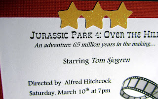
It was my husband 50th birthday and I had fun with it.  My family and friends had such a blast with the gag gifts and Tom was such a good sport about it all.  The funniest was the blow-up walker and he posed with it like a trooper.  He has great sense of humor and that's one reason I love him.  I made this fun invitation since it was a movie night theme. 

I Used:
- Provocraft Art Philosphy Cricut Cartridge, p64 - decorative layer feature+ rectangle3 for the white cardstock for the word ticket; decorative layer feature + shift + rectangle 3 for the red ticket; and rectangle3 for the backing also white

-Provocarft Carousel Cricut Lite Cartridge  - font feature + shift + train4 for the three stars

- Southwest Resume Paper for typing the invitation - it has such a nice texture!

- Movie Reel clipart - There are a number of free ones out there - Just Google! :)

- Movie Tagline - This is an acutal tagline from the original Jurassic Park movie and thought it would be fun to add to the invite.

- Martha Stewart - Stars Edge Punch

- cardstock from Die Cuts with a View (DCWV)


I cut all the pieces at 3.5 inches.  I printed one sheet of the wording for the invitation.  This was the hardest part since I had to print the paper out a couple of times to make sure the wording would fit in the ticket.  I placed the red ticket diecut over the wording several times.   This helped me check the font size to adjust.  Since I knew these were prototypes, I used regular copy paper until I was happy with it and then printed using the resume paper.


After that it was easy!  Just paste it all together and you got yourself a fun handmade invitation!


Now for the envelope.  Not much to tell except that I hand cut it.  I made slightly smaller than the invitation so you can slip the ticket in and out easily.   I also cut the edge with Martha Stewarts Stars Edge Punch. 


If you look carefully you can see that I added some of the stars from the punch on the envelope:

I hand wrote the guest's name next to stars and they were ready for hand delivery! 


Do something fun because as Dr. Seuss said: Fun is good