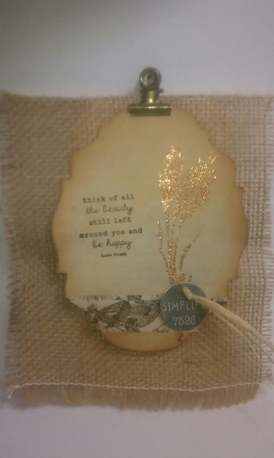
Tuesday, January 27, 2015
Succulents in Winter
It was not as hard as I thought it was going to be to make these. Once I started, it got easier and easier to put them together.
Thank you for looking!
Monday, August 25, 2014
Stamp - A - Faire 2014
This one was Vintage Patterns for a 1940s look. I tried to do a bigger pattern across the page but that was a disaster! (Well, maybe five disasters...) I finally decided to do smaller patterns and tried to make it like an embroidery hoop.
Materials: Classic Kraft paper, Explore the 1940s with Besty Veldman stamp set and background paper (PTI), lace
This one was called Sparkle and Shine for a 1920s look. I really liked doing this one. I used sticky embossing powder for the glitter and it worked like a charm. The end result was super elegant.
Materials: Fine Linen and Smokey Shadow, Deco Die Cover Plate, Explore the 1920s with Heather Nichols stamp set and paper (PTI), Styled Labels die (Sizzix) embossing powder, Sterling glitter (Martha Stewart) and rhinestones
Antique Embossing is from the Regency Era challenge. I used silver embossing powder, stamped it, and then used Distress Ink Black Soot for that antique look. Loved it! It gives the embossing a look like it had aged.
Materials: Smokey Shadow paper, Explore the Regency Era with Melissa Phillips stamp set and paper (PTI), embossing powder, Black Soot Distress Ink (Ranger), sequins (Mon Ami Gabby)
This one is Renaissance inspired. The challenge was for Velvet Stamping but I had no velvet fabric or even flocked paper that might work. I really wanted to used the stamp and dies, though. They are so elegant. Put together they remind me of the beautiful stained glass rose windows one sees in old churches and cathedrals. I did not stamp on velvet - just regular paper. I added little liquid pearls and ribbon.
Tuesday, July 29, 2014
Diamond Wallpaper Stamping
Papertrey Ink has a tutorial about making your own background using stamps for Make It Monday #174. It looked cool so I decided to try it out. My first couple of tries were duds! I was rushing things so the diamonds were super crooked. I was more careful with this one and I am pretty happy with how it turned out. I popped up the Chrysler Building, which is my favorite building in NYC. I love that Art Deco look.
All the stamps used are from City Scene by Papertrey Ink, which I was happy to finally use! Oh, except the sentiment. That's from their Road Trip stamp set.
My husband and I live near the NYC so I am going to use this card to ask him out on a date. Of course, he will say yes ;-)
Sunday, June 8, 2014
No.1 Dad Box Card
Princess Tag
The pattern paper is from SEI. Hard to see but is a very light green with light gold. So pretty! The shimmery white paper is from Papertrey Ink. The blue paper is from DCWV.
Here was my tag:
Saturday, May 3, 2014
Itsy Bitsy Stencils
I love butterflies. I think of spring and flowers and beauty when I see them. So I decided to make a stencil with butterflies to make a card using them.
I placed it on top of cardstock and then I pounced some color. I wanted it to be colorful so I used yellow, blue, green, and a touch of pink to pick up the color of the die cut butterfly. I like that adding the colors lightly gave the background a soft, watercolor look to it.
![]() |
| The paper is 6 x 6 |
![]() |
| I only did some of the butterflies not all. |
Next, I cut a butterfly from the Hannah Montana Cricut cart. The butterfly images in this cart are so pretty.
The sentiment also a stencil. I used the Everyday Fonts cart for it. I pounced the color and then outlined the letters with a fine line marker to make it stand out a bit more than the butterflies in the background.
I left it simple for the CAS look which I seem to be gravitating towards now :)
I cut the butterflies at .50 in each and the font at .75 which is why called the stencils itsy, bitsy -- plus it sounded cute :)
I used gesso on this card for some texture and a different look. I used the herringbone image from the Edge to Edge cart. I cut it at 8 inches and just slapped on some gesso - which shows in some places... I think that if I use a temporary adhesive next time it will give me a sharper image. I'll try it out next time.
The suave gentleman is from the Suburbia cart. I was inspired by Nadia from With Glittering Eyes blog here and here to change the image a silhouette to a more dimensional image. He is no Ryan Gosling but I think he came out alright! :D
I added a "hey, girl" sentiment to it. If you're not familiar with "Hey, girl" and Ryan Gosling, check out this pinterest board. I don't know what I am going to put inside it, yet. Maybe: "hey, girl... the glitter in your hair, ears and teeth really set off your eyes" or "hey girl... let's organize your paper collection by color and texture." I get a kick out of these!
Friday, April 4, 2014
Froggy Baby Card
It could make you wonder why
But why wonder, why wonder?
I am green and it'll do fine
It's beautiful and I think it's what I want to be"
Sunday, March 2, 2014
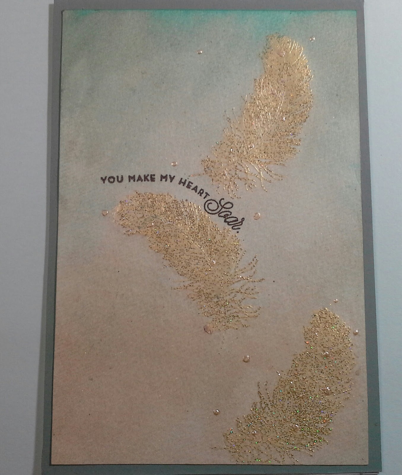
Watercolor Backgrounds
At first, it looked like a big ole mess. I got a little too happy splashing colors and had pools of color all over! Trust me - it was not pretty. Thankfully, this technique is really forgiving I had to blot out quite a bit and then I went over it again with a flat brush.
Next time, I will try out the second way - to do the background and then heat emboss. I had gotten some saturated color where the images had spaces and it was tough to soften. Doing the background first will make it more uniform.
I decide to enter this in Craft Creations Challenges - Challenge 257, Keep It Simple, Simon Says Challenge - Anything Goes with Pearls, and Virginia's View Challenge #1: Watercoloring.
.
Materials:
Papertrey Ink- Feather Finery Stamp Set
- Smokey Shadow Dye Ink
- Ocean Tides cardstock
- Peacock Feathers Distress Stain
- Bisque Liquid Pearls
- Moonshadows in Gold Doubloons and Buccaneer Bay Blue
Saturday, February 8, 2014
Valentine Blog Hop 2014 - Butterfly Pops
I made two different kinds. The first batch, I made with my boys in mind. I figure my oldest can take some to school for Valentine's Day since they did not take any time at all. Here are some of them:
I wrapped the lollipops with crepe paper and wrapped some baker's twine around them. Honestly, I didn't use any fancy crepe paper. I used crepe paper left over from party streamers - waste not, want not!
Make sure to trim the bottom of the crepe paper. If you don't, the lollipops look like colorful ghosts.
I made 4 incisions that were about .75 inches.
![]() |
| You don't have to be super precise with the incisions. |
![]() |
| Put the stick through like so. |
I attached the little hearts to them and that's it! They are ready for some yummy Valentine's gift giving.
The great thing about these Valentine Butterfly pops is that you can gussy them up. I made this one for my hubby:
The butterfly cut is from the Hannah Montana. I cut it at 4 inches.
![]() |
| I spritzed the shadow with some gold mist and it left spots. It didn't matter, though, because most of it is covered by the pattern paper. |
I trimmed off the head and tail of the butterfly on the pattern paper.
I used a smaller lollipop, which I ended up liking better. (Smaller = A lot less sugar. Oh well, Valentine was meant to be sweet!) I wanted to cover it in brown tissue but I didn't have any. So I did what any crafty girl would do - made my own. I sprayed so much color on this tissue it had no choice but to change. To speed up the drying process, I used a heat tool.
![]() |
| Before |
![]() |
| After :) |
I wrapped some brown twine around it for an elegant but rustic look. The heart is from Pink Journey is cut a 1.25. I spritzed it to give it some shine.
I hope you enjoyed your stop here. In honor of Valentine's Day, I am offering a giveaway. Please leave a comment to enter for chance to win a "Cross My Heart" embossing folder and border. Make sure you leave a way I can contact you via email. I will announce a winner on Monday :)
Last, but certainly not least is the lovely Scrapalette. Check out her Valentine's Day project at Around the Block with Scrapalette. She always has such great ideas!
Here is the entire blog list:
3. gonescrappin - Col's Creative Corner
5. Scootingranny - Scootingranny's World
6. MamaC - Carolyn's Creative Corner
8. MariaJ - Stamp, Cut, Create!
9. Di&Co - Creating Is Like Breathing
10. Dragonfly50 - Designs by Dragonfly
11. TiffysMom - Angie's Paper Passion
12. *Violette* - Whimsical Treasures
13. cricutaddicted - ScrappingForMoreFun
14. LoriSjogren - The Singing Shell <------ You Are Here
15. Scrapalette - Around the Block with Scrapalette <------ Go Here Next
Materials & Supplies for fun butterflies
Cricut cartridges: Pink JourneyCardstock: Martha Stewart
Stamps: Papertrey Ink Mini Mega Messages
Crepe paper: party streamers
Baker's twine from my stash
Lollipops: Blow Pops
Materials & Supplies for elegant butterflies
Cricut cartridges: Hannah Montana, Pink JourneyPaper for elegant butterflies: DCWV, Co'redinations
Stamps: Papertrey Ink Mini Mega Messages
Color Spray: Gold Doubloons from Lindy's Stamp Gang, Espresso Color Wash from Ranger
Twine: Tori Spelling
Lollipop: Dum Dums
Saturday, January 25, 2014
Papertrey January Blog Hop
I pulled out my Simply Jane stamp set & dies and some Soft Stone, Sweet Blush, and Hibiscus Burst paper . This what I came up with:
I drew in some grass at the bottom of the frame and used Meadow Greens for the "tree" in the background because I pictured Mr. Darcy and Elizabeth out for a walk like in that last scene of the movie version of Pride and Prejudice. "You have bewitched me, body and soul..." Swoon!
I embossed the frame with the Woodgrain Impression Plate. Some Perfect Pearls in Pewter was dusted lightly on the frame give a little contrast. I added some ribbon, a flower, and a doily. I added Clear Rock Candy Dry Stickles to the figures so they would stand out but still show the Hibiscus Burst color of the paper.
![]() |
| Die-cut leaf is from Meadow Greens |
All products are from Papertrey Ink except: Perfect Pearls, Stickles, ribbon, flower and doily.
I made a second card (not part of the Blog Hop but thought I'd share) because I just could not stop using the stamp set:
Sunday, December 15, 2013
Christmas Cupcake
I saw a Hallmark ornament and thought it would make a cute little card. I made some adjustments to make her all mine :) I used the Jolly Holidays and From My Kitchen Cricut cartridges. I cut Santa's little helper at 3.5 and I cut the cupcake at 2.5. I also cut the recipe die cut from From My Kitchen but I don't remember the dimensions. I cut off the legs (!) and skates and positioned her on top of the cupcake. I used gesso to give dimension on the cupcake frosting and the hat. Honestly, I don't know much about using gesso. I just slapped it on, swirled it a bit and waited for it to dry. I added some sparkle with Stampin Up Smooch Moonlight Pearlized Accent Ink and sequins that I colored with a Copic marker to make them yellow.
I entered my card on:
Fantabulous Cricut Challenge - #190
Crafty Boots Challenge - Christmas
Cute Card Thursday - Challenge 299, Christmas Catch Up
Thanks for looking and have a wonderful day!!
Friday, October 25, 2013
Papertrey Ink Blog Hop - Tags

I made these Christmas tags for the Papertrey Ink Blog Hop which calls for making at least 5 tags. I used some very nontraditional colors - dark gray, black and pearly white. To make my tags, I used Smokey Shadow cardstock and my new favorite stamp set, Meadow Greens. I think it is very versatile - not just for spring. "Peace" and the leaf are both from that set. I cut out the tags using the biggest die from the Angled Labels Die Collection.
![]() |
| Look at the glitter! |
Sunday, October 20, 2013
Thanksgiving Tag
I did this tag for a Prima Doll Thanksgiving Tag swap. I love Thanksgiving because of the fall colors. Mostly, I love it it because it is a reminder of how blessed I am.
I only have 3 of the Prima Dolls by Julie Nutting but I chose the one with the peasant dress because I thought the colors would go well with dress. I don't know why.
I colored her using distress markers and copics. I did the skin with the Copics and the rest with Distress Markers. I wanted to use the Distress Markers for all of it because I do like that watercolor look. But skin using Distress Markers come out looking washed out so I am still experimenting with them. I have to find the right color combo for skin.
I fussy cut the dress from pattern paper by My Mind's Eye and then added shadows with the markers. I also added some Victorian Velvet Distress Glitter which a nice vintage look. I added Glossy Accents to the Headband and the shoes.
The background paper is from Prima Sunrise, Sunset line. I spritzed a little Tattered Angels Mist and then added some leaves and a sentiment: Give thanks and in all things be grateful. The leaves and the sentiment are from Stampin' Up. The green ribbon is from Making Memories. The twine and ribbon are from my stash. The ribbon was a bright yellow color but it just did not go with the muted tones in the tag so I dyed it with Mustard Seed Distress Marker. That toned down the ribbon and it goes much better now :)
I decided to enter my tag in:
- Challenges 4 Everybody - Anything Goes
- Inky Impressons - Challenge 130, Fall/Autumn
- Paper Playtime - Challenge 21, Ribbons & Buttons
- Really Reasonable Ribbon's Rambling - Challenge 82, Autumn Leaves and Ribbons
- The Sisterhood of Crafters - Anything Goes
- Stamping for the Weekend - Anything Goes
Friday, October 11, 2013
Creative Chemistry 102, Day 5
![]() |
| With flash so you can the shine :) |
Creative Chemistry 102, Day 4
Day 4 was yesterday but better late than never :)
Yesterday's focus was alcohol inks and my hands are a mess but it was fun! I made a Christmas ATC using the ATC die from Tim Holtz. I tried out the Monoprint technique and used Stream, Stonewashed and Cool Perl alcohol inks with a splash of Alcohol Blender. I let that dry which did not take long at all and stamped it with a mini snowflake.
Then I tried out the tinted Tinsel technique. I tinted the one piece of tinsel in Oregano Alchol Ink from Adirondack and left another piece untinted. I twisted them together and them stapled it with my Tiny Attacher.
I punched some small circles with my hole puncher and they became little berries. Lastly, I added a word band from Idea-ology.
Wednesday, October 9, 2013
Creative Chemistry 102, Day 3
In this first one, I tried out using a brayer with Distress Stains. I used Chipped Sapphire and Tumbled Glass. I thought it made a nice background for a night sky and turned it into a birthday card. I added some star die cuts from Papertrey Ink and ticket from the Mini Filmstrip and Mini Ticket die.
In the next one, I tried out photo tinting with Distress Markers - Chipped Sapphire, Broken China, and Worn Lipstick. I tried out really soft color like Milled Lavender and Weathered Wood but colors like that blended into the photograph. I tried out stronger colors and the colors pop some more with being too out of place on a wedding photo.
I also tried out Cracked Glass by applying Distress Crackle on clear plastic cut with the Baroque die. It took soooooo long to dry but I think the effect is well worth the wait! I blended in some Adirondack Ink Metallic Mixatives in Gold. The swirl is from the Elegant Flourishes die.The seam binding is dyed with Vintage Photo and Walnut Stain. I am very happy with how it turned out.
![]() |
| I thought I might put it on a card but I think I will just hang it :) |